Voyageur Brewing Company
Charting a course for the North Woods.
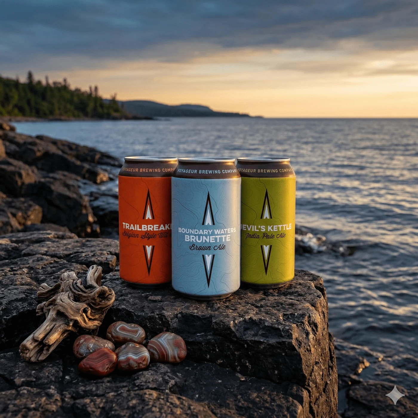
The mission: packing the spirit of the Boundary Waters into a can that sells itself off the shelf.
Craft brewing is crowded, and Minnesota already has its loyalties. Voyageur needed more than good beer; it needed a brand that felt native to the canoe-country identity it was named for, without sliding into cliché cabin-and-loon territory. The challenge was to translate the grit, silence, and adventure of the Boundary Waters into a visual system that held up at retail, on a van, and across a growing lineup of SKUs.
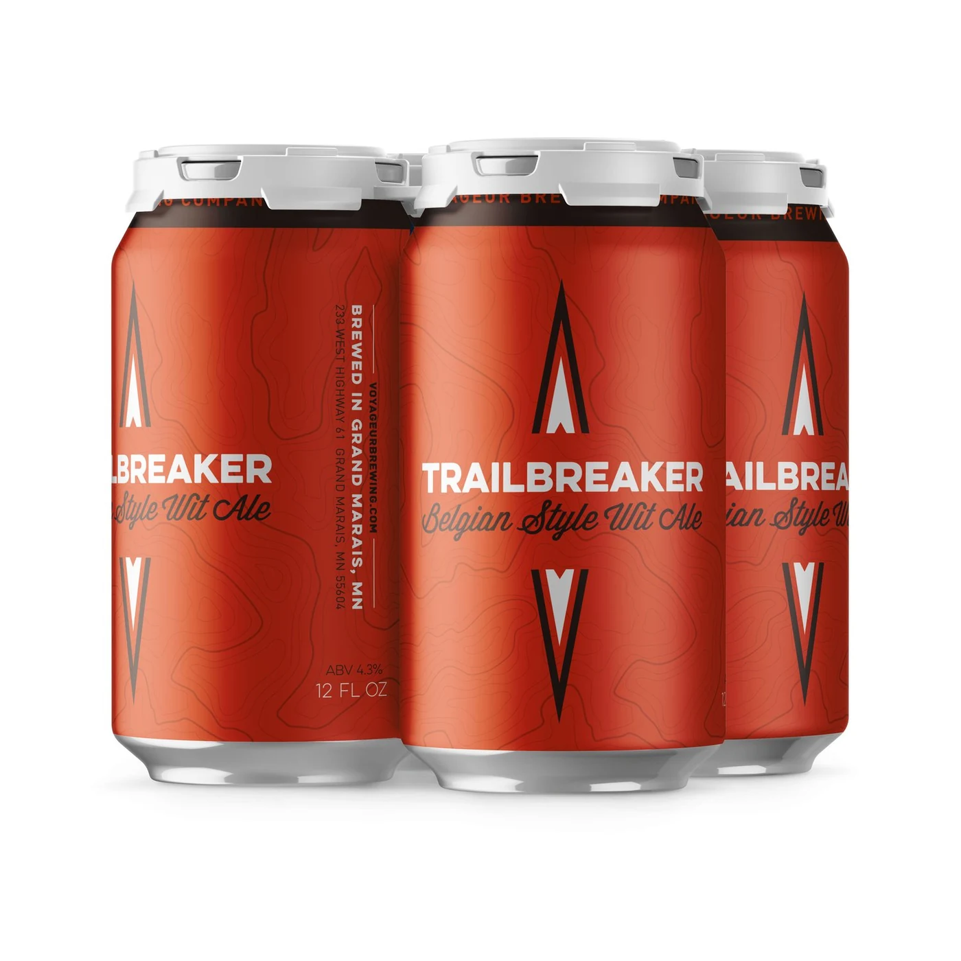
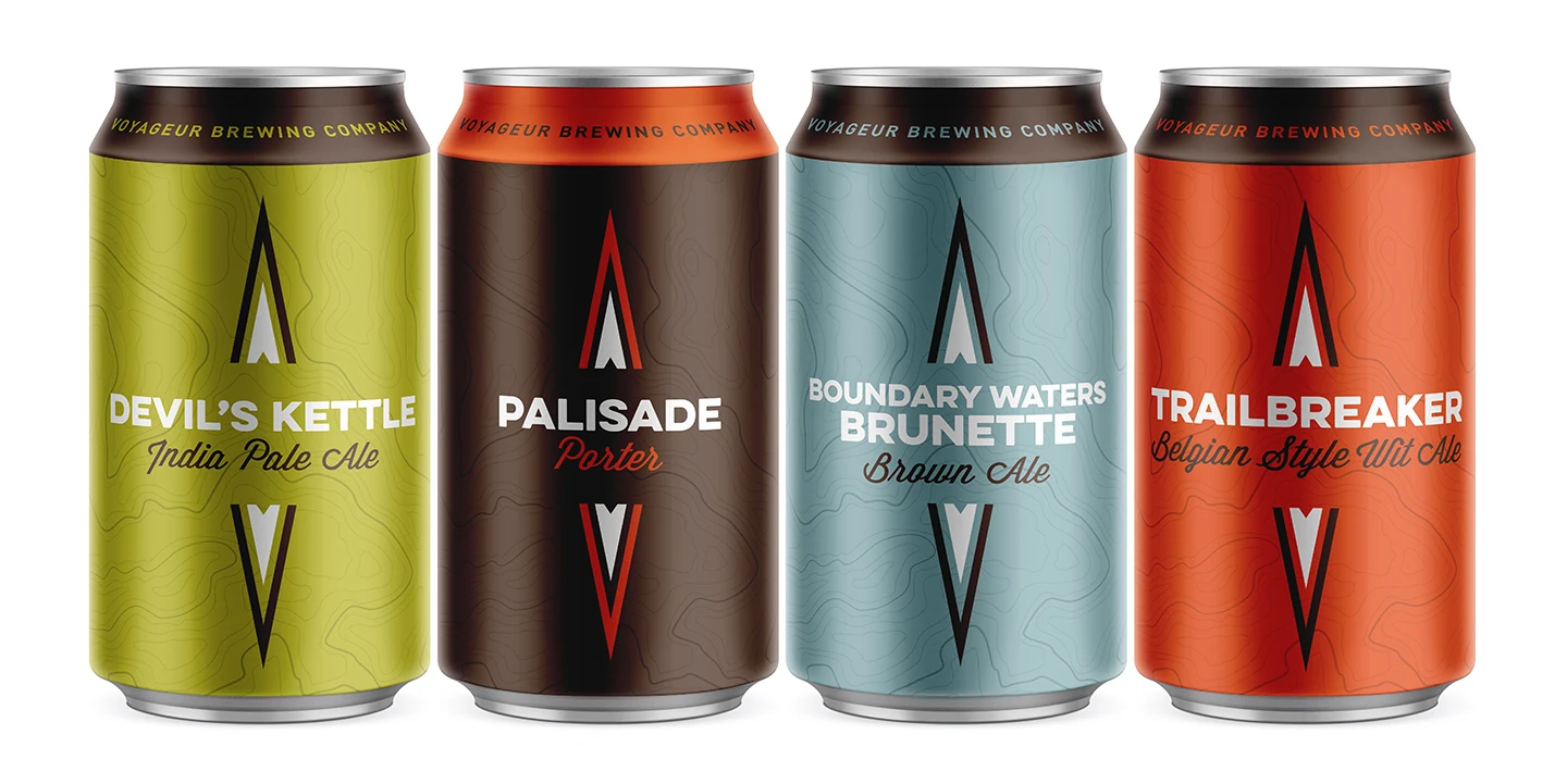
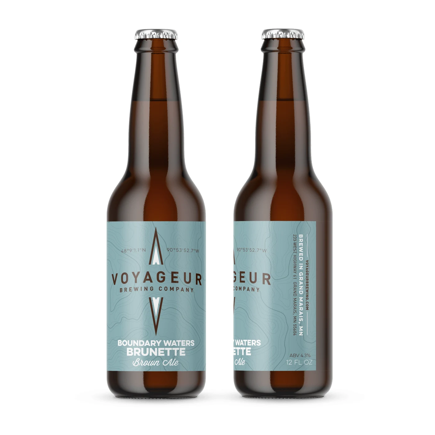
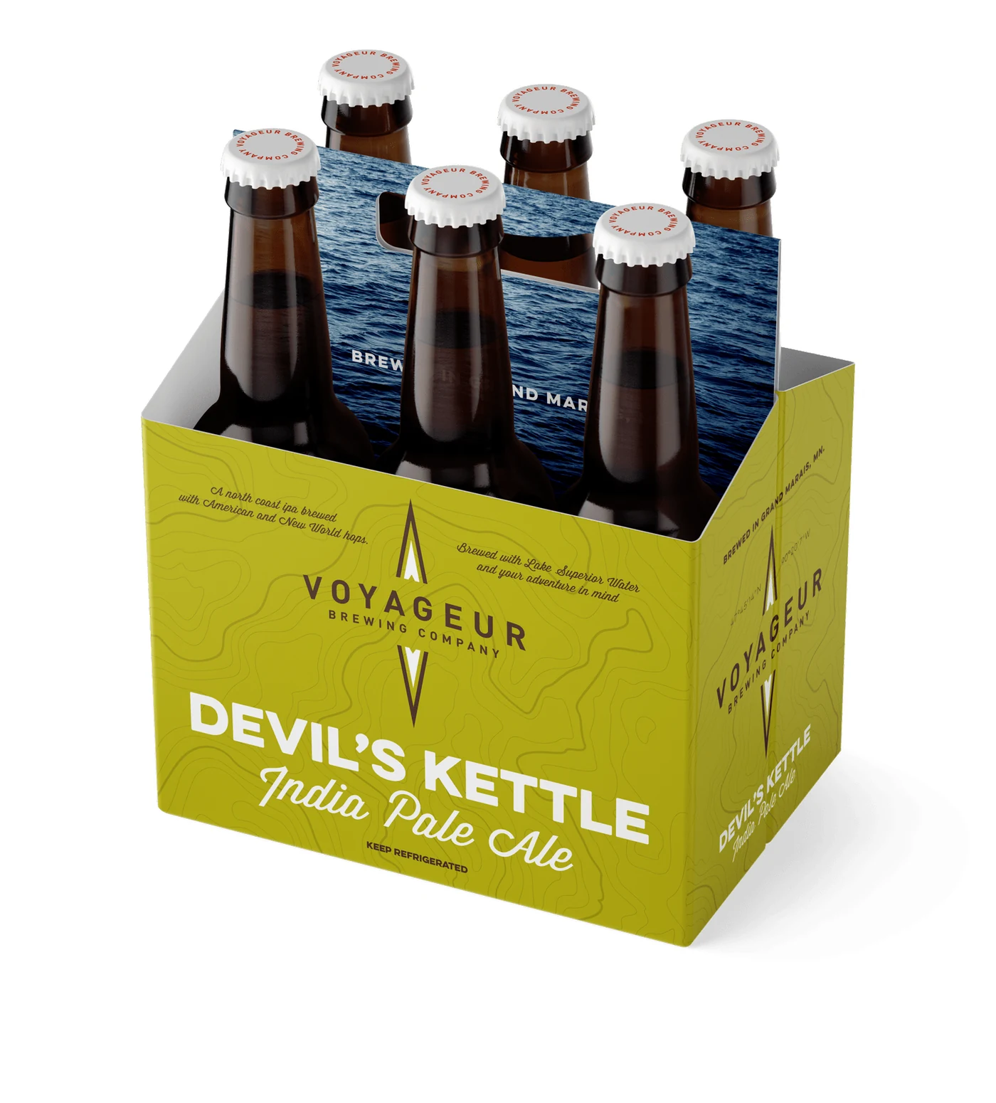
I built the brand around the idea of the voyageur itself: the independent, tough-as-nails paddler who opened up the North. That meant a palette drawn straight from the region: lake-stone grays, agate oranges, deep pine greens, and the hard blue of a northern dusk. The naming system carried the story across the lineup. Trailbreaker, Boundary Waters Brunette, Devil's Kettle. Each one a place or a moment you could hold in your hand.
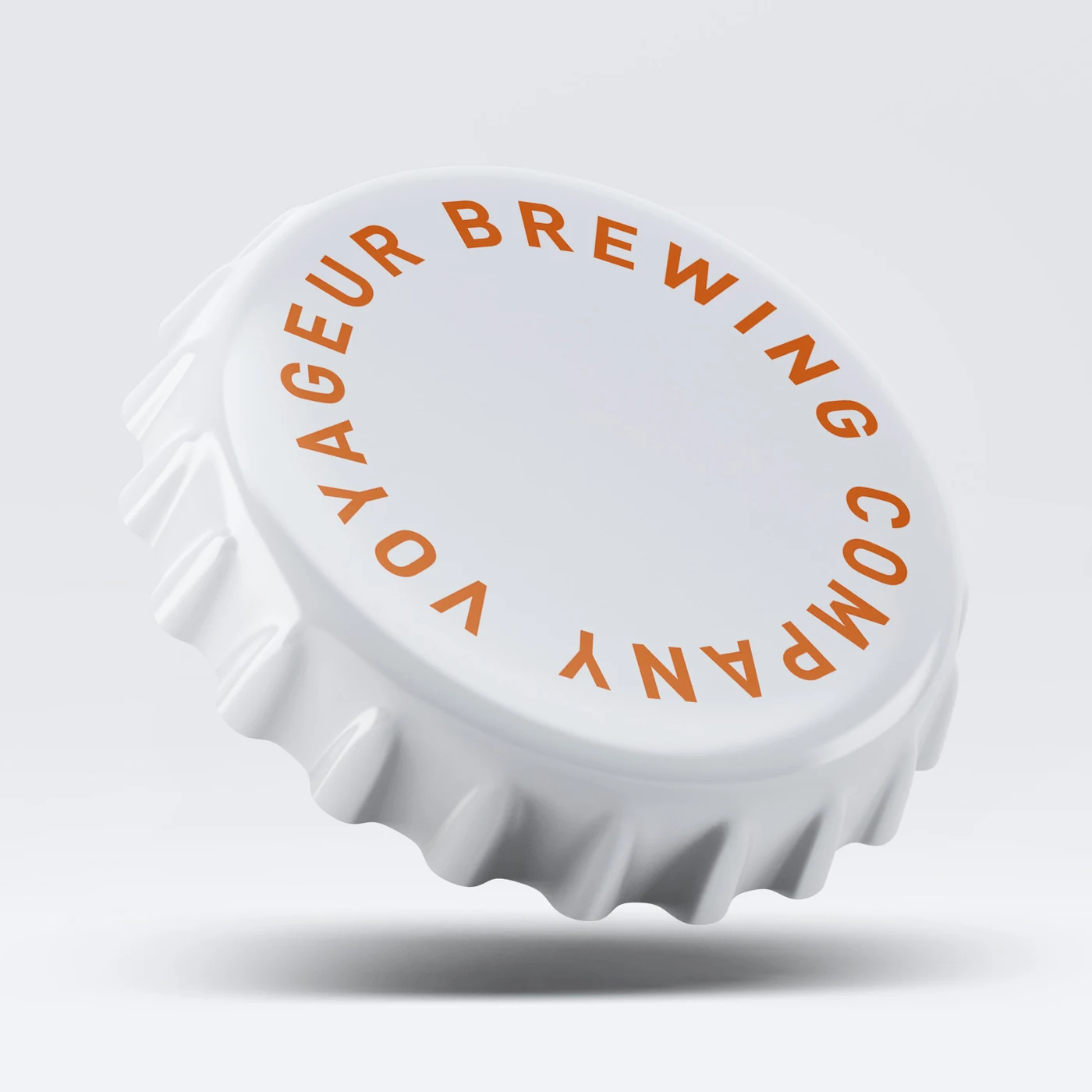
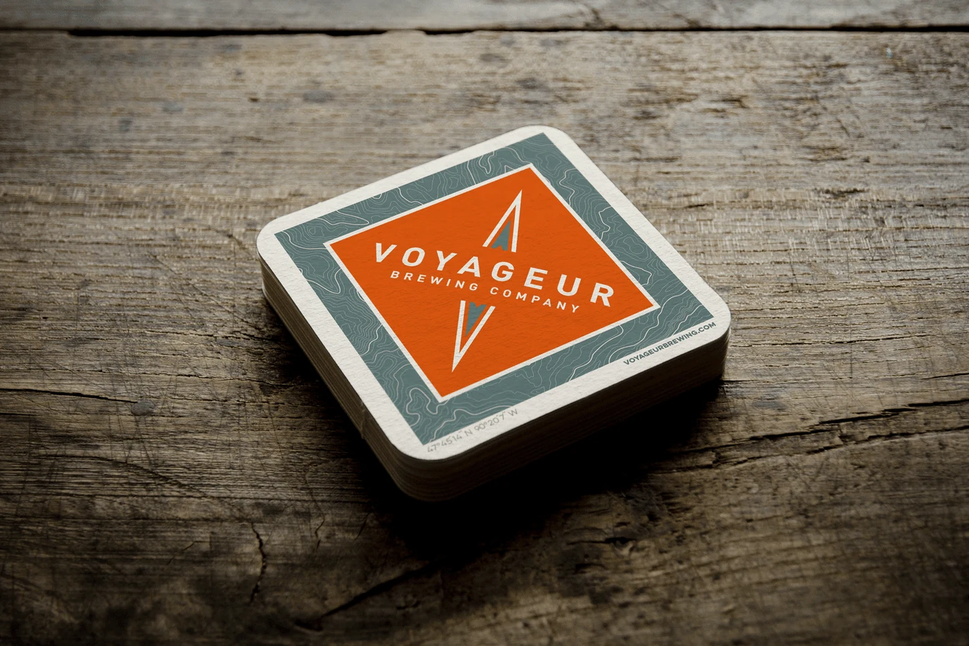
The goal was to make the packaging feel like gear, not grocery. Every can, cap, and coaster was designed to look like it had earned its place in the pack.
- Identity System: Built a wordmark and secondary marks flexible enough to stretch across can labels, growlers, coasters, and apparel without losing their shape.
- Line Architecture: Developed a naming and color-coding system so new releases could plug into the family without reinventing the visual language each time.
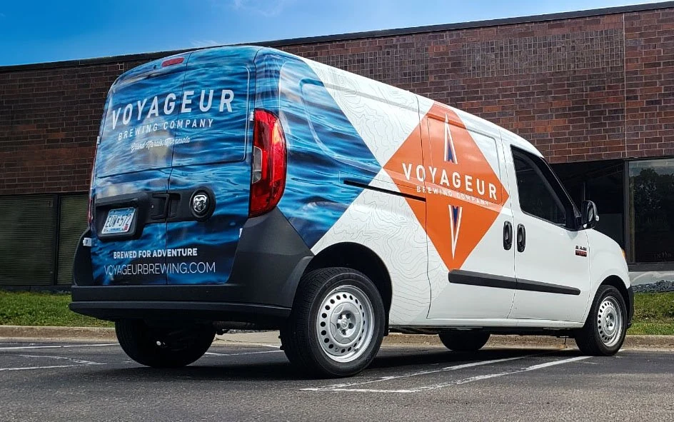
- Mobile Billboard: Designed a full vehicle wrap that turned the delivery van into a rolling postcard for the North Woods: high-impact at a glance, readable in traffic, and built to take a Minnesota winter.
- Retail Toolkit: Delivered point-of-sale materials, coasters, and shelf talkers that carried the brand from the taproom to the liquor store shelf with consistency.
- Shelf Standout: The can lineup reads as a cohesive family on shelf, distinct enough to tell flavors apart and unified enough to build recognition trip after trip.
- Brand Extension: The system has scaled across new releases and retail formats without losing its regional identity.
- Mobile Visibility: The wrapped van turned distribution runs into brand impressions across the region, doing work a static logo never could.
We started with just an idea and Chris transformed it into a cohesive and professional brand identity. His ability to translate our vision into a distinct, recognizable craft brand gave us the confidence we needed to launch. Since our debut, the feedback on our branding has been incredible—our cans and logo consistently stand out on the shelf and behind the bar.
Mike Prom
Owner & Chief Manager, Voyageur Brewing Company