Brother Justus Whiskey Company
Distilling a Minnesota legend.
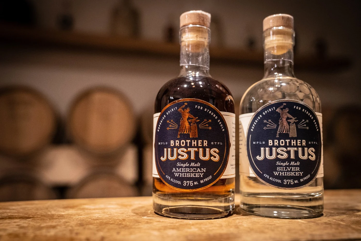
The mission: engineering a visual identity for a noble rebellion, rooted in the cold oak and flinty history of the American Single Malt.
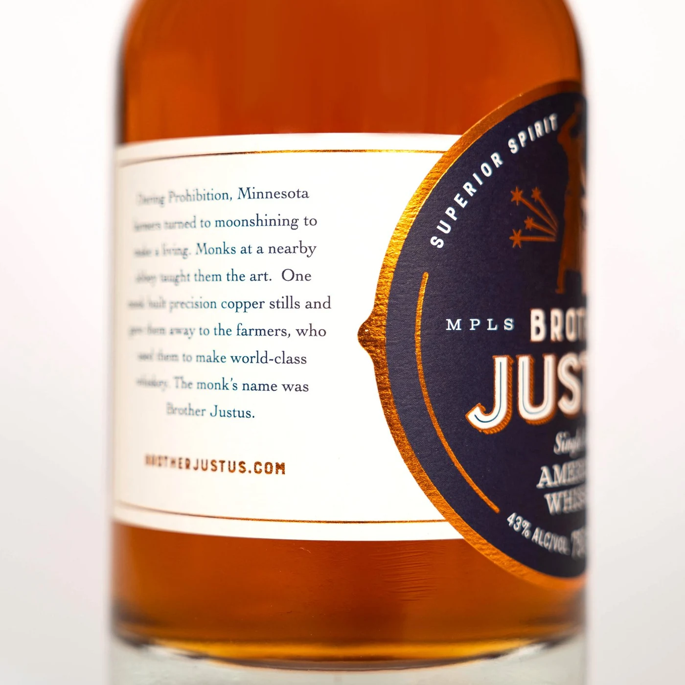
The Brother Justus Whiskey Company (BJWC) needed to bridge a massive gap: they were a modern, high-tech Minnesota distillery with a story rooted in the “underground” history of the Great Depression. The challenge was to honor the legacy of Brother Justus (a Benedictine monk who built world-class stills for poor farmers to save them from ruin) without falling into “prohibition-era” clichés.
We identified the core of the brand as a Noble Rebellion. Unlike “macro-distilleries” that use faux-craft labels to hide mass-produced grain alcohol, Brother Justus was built on radical honesty and “Conscience-driven” craft. The strategy was built on four pillars:
- Story: Using the brand as a vehicle to tell “magical” stories that embolden people to do good, even when it breaks the rules.
- Craft: A disciplined, obsessive focus on the “purest hearts” of the run, aged exclusively in Minnesota white oak.
- Honor: A commitment to integrity and transparency in an industry often filled with misleading marketing.
- Rebellion: Positioning the brand as a “refuge and haven” for those seeking quality over noise.
I translated this “Heroic and Dangerous” personality into a sophisticated visual code that appeals to everyone from craft beer enthusiasts to underserved whiskey markets.
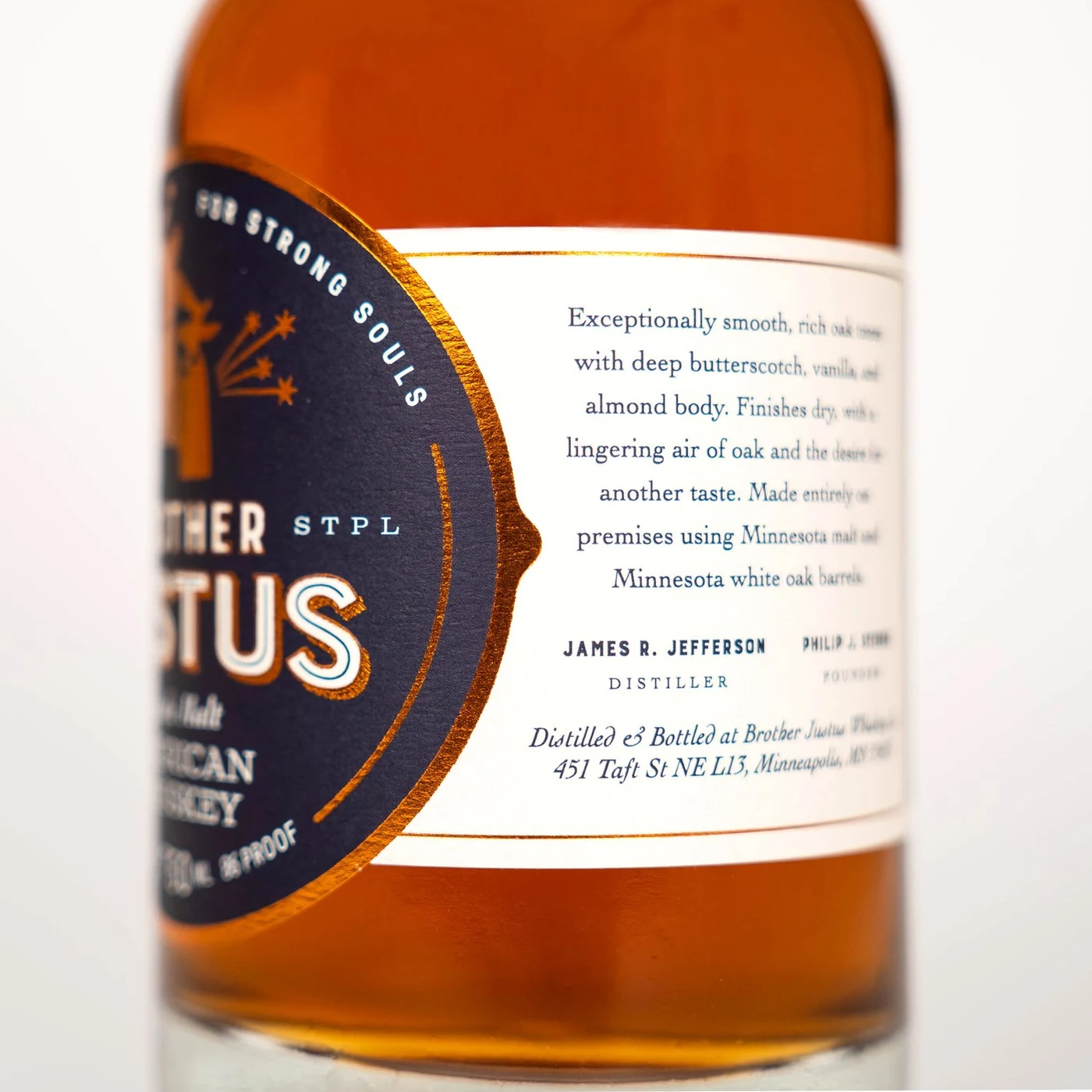
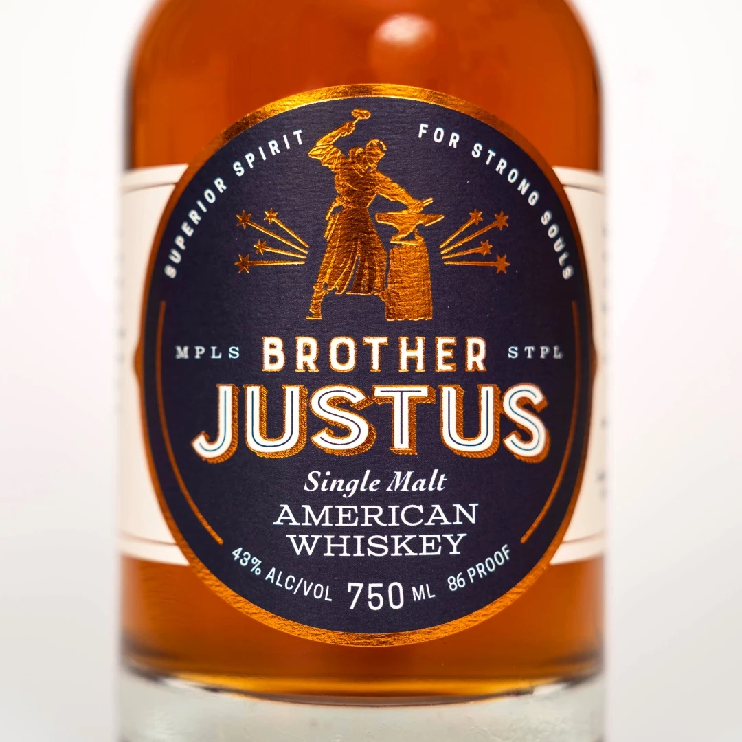
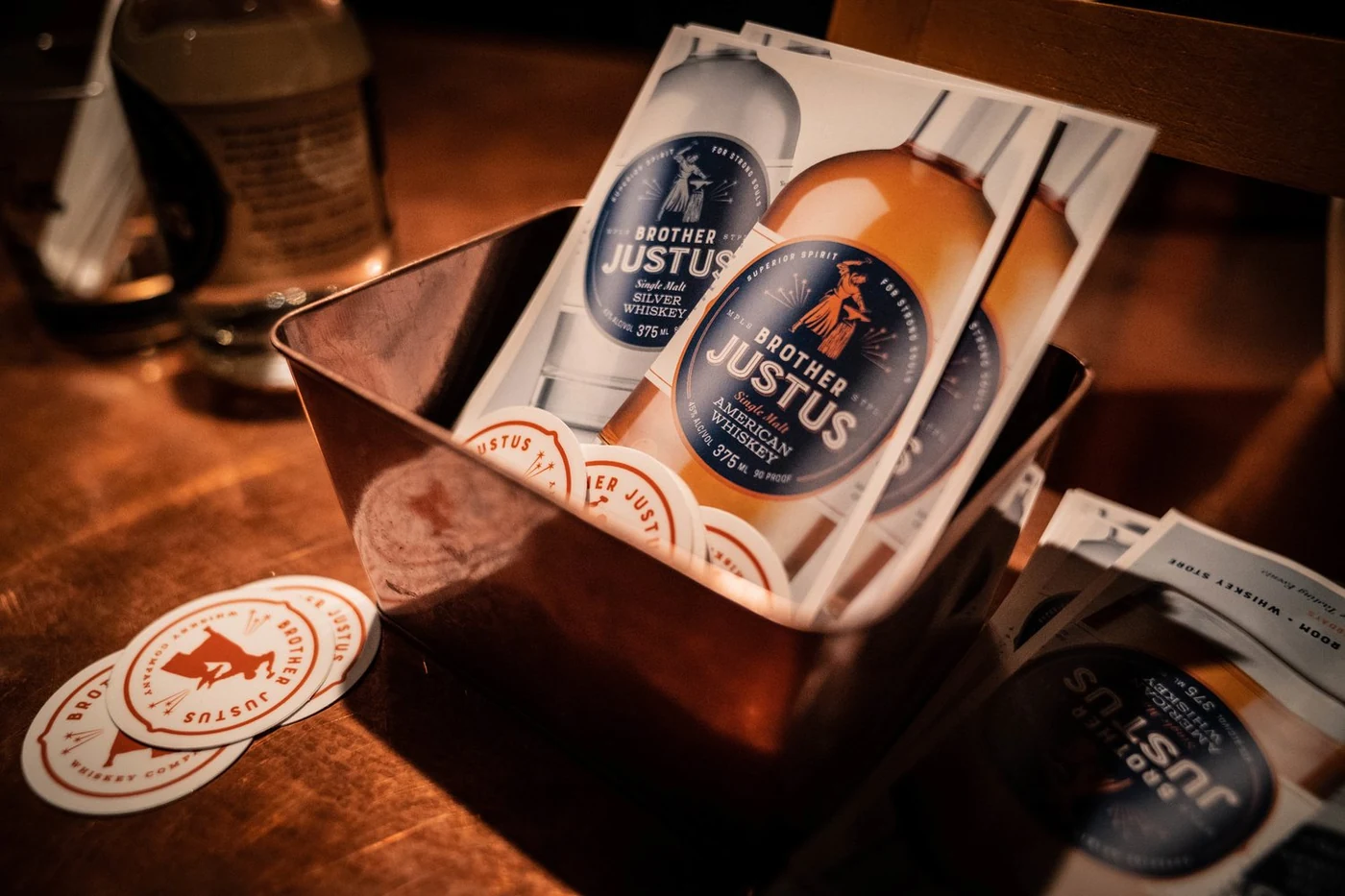
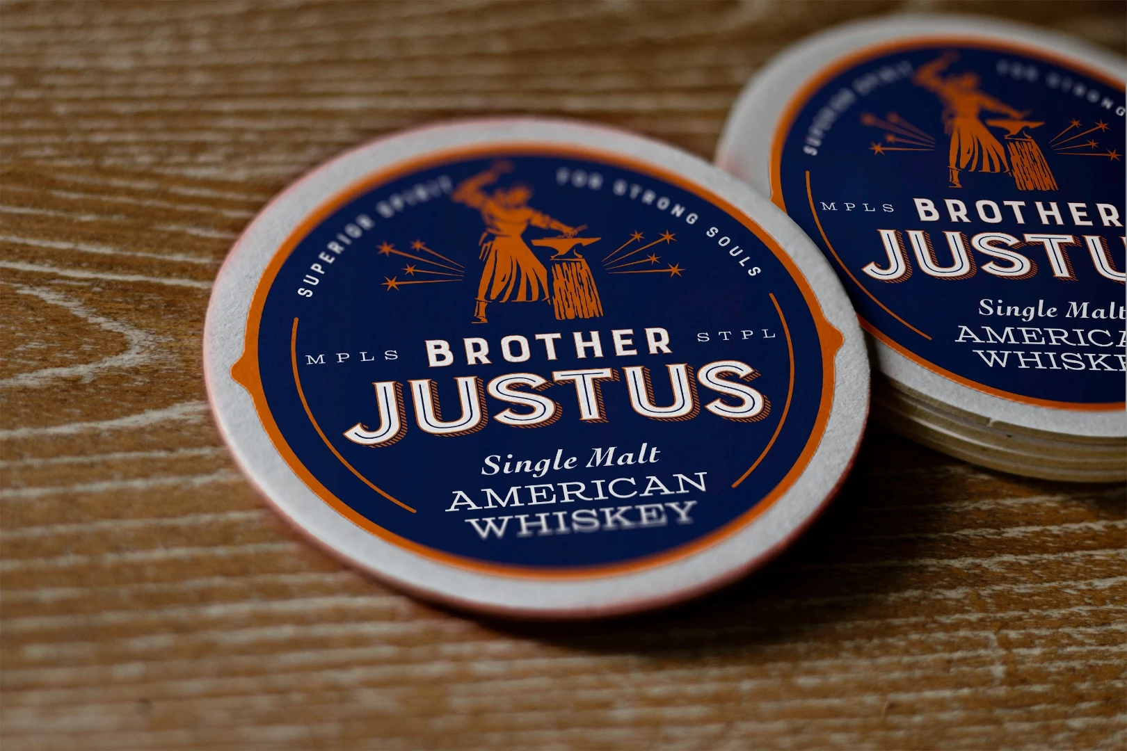
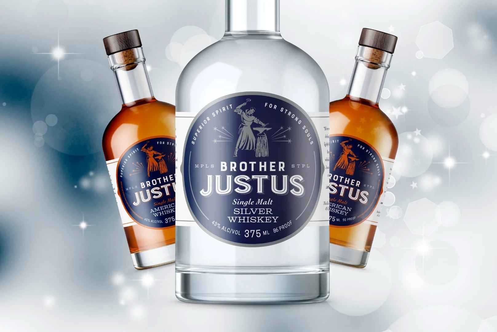
- Industrial Symbolism: Utilized a palette of Copper, Blue, and Black, paired with symbols of the “Monk-Blacksmith” (hammers, anvils, and whiskey stills) to represent the labor of human hands.
- Atmospheric Design: The aesthetic was influenced by “Dieselpunk” and “Art Nouveau” to create a “Light in the Darkness” vibe: mysterious, warm, and covertly “dangerous.”
- Authentic Authority: The final identity successfully transitioned Brother Justus from a local startup to a credible authority in American Single Malt, providing a high-status drinking experience for those seeking adventure and connection.
- Market Distinction: Successfully differentiated the brand from large out-of-state competitors by leaning into its authentic Minnesota roots.
- Cultural Resonance: Created a brand that feels like a “refuge,” attracting a diverse demographic of drinkers who value depth over surface-level trends.
- Strategic Growth: Provided a foundational identity that remains “solid” while allowing the company to evolve as new business challenges arise.